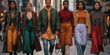
Mastering Color Theory: Crafting Your Perfect 2026 Wardrobe Palettes
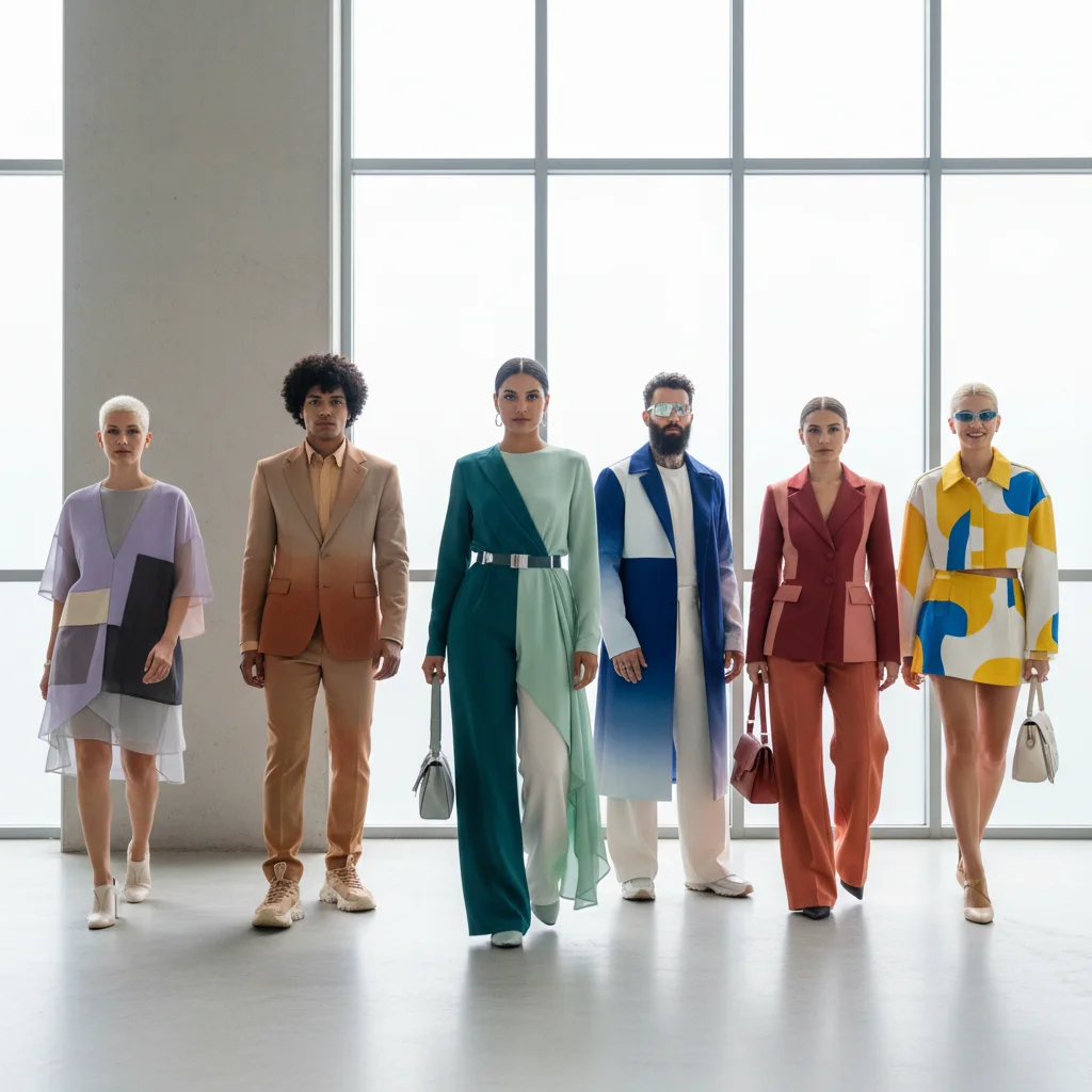
Mastering Color Theory: Crafting Your Perfect 2026 Wardrobe Palettes
In the ever-evolving world of fashion, staying ahead means more than just following trends; it means understanding the fundamental principles that make an outfit truly shine. One of the most powerful, yet often overlooked, tools in your style arsenal is color theory. For 2026, building a wardrobe that is not only stylish but also cohesive and reflective of your personal brand hinges on mastering your wardrobe color palettes. This comprehensive guide will walk you through four essential steps to curate perfect palettes that will transform your approach to dressing, ensuring every item works harmoniously together and elevates your overall look. Forget fleeting fads; with these principles, you’ll create a timeless and versatile wardrobe.
The impact of color on how we look and feel, and how others perceive us, cannot be overstated. Colors evoke emotions, communicate messages, and can dramatically alter the perception of your physique. A well-chosen color palette can make you appear more vibrant, sophisticated, approachable, or authoritative. Conversely, a haphazard collection of colors can lead to a disjointed and uninspired wardrobe. By focusing on creating intentional wardrobe color palettes, you’re not just buying clothes; you’re investing in a system that simplifies dressing, maximizes versatility, and ensures you always look your best. As we look towards 2026, sustainability and thoughtful consumption are also key, making a curated, color-conscious wardrobe an intelligent choice.
Step 1: Understand the Basics of Color Theory for Your Wardrobe
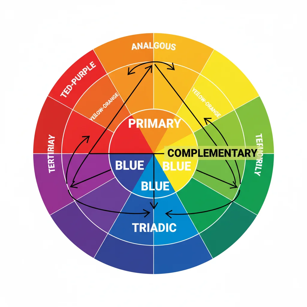
Before you can build impeccable wardrobe color palettes, a foundational understanding of color theory is crucial. This isn’t about becoming an artist, but about grasping how colors interact and what makes them visually appealing when combined. The color wheel is your best friend here, providing a visual representation of primary, secondary, and tertiary colors, and illustrating their relationships.
The Color Wheel Explained
- Primary Colors: Red, blue, and yellow. These are the fundamental colors from which all other colors are mixed.
- Secondary Colors: Green, orange, and purple. Created by mixing two primary colors.
- Tertiary Colors: Red-orange, yellow-orange, yellow-green, blue-green, blue-violet, red-violet. Formed by mixing a primary and a secondary color.
Key Color Relationships for Wardrobe Harmony
Understanding these relationships will be the bedrock of your wardrobe color palettes:
- Complementary Colors: These are colors directly opposite each other on the color wheel (e.g., red and green, blue and orange). They create high contrast and vibrancy, making outfits pop. Use them for bold statements or accents.
- Analogous Colors: These are three colors next to each other on the color wheel (e.g., blue, blue-green, green). They create harmonious, soothing, and sophisticated looks due to their shared undertones. This is an excellent choice for elegant wardrobe color palettes.
- Triadic Colors: These are three colors equally spaced on the color wheel (e.g., red, yellow, blue). They offer a vibrant and balanced look, often used for playful or creative ensembles.
- Monochromatic Colors: Different shades, tints, and tones of a single color. This creates a sleek, sophisticated, and elongating effect. Think various shades of blue, from navy to sky blue. This is a very chic way to build a wardrob color palette.
- Warm Colors: Reds, oranges, yellows. These colors tend to be energetic, passionate, and draw attention.
- Cool Colors: Blues, greens, purples. These colors are often perceived as calming, serene, and sophisticated.
By consciously selecting colors based on these relationships, you can ensure that your outfits are always visually balanced and appealing. This foundational knowledge will empower you to move beyond simply liking a color to understanding how it functions within an ensemble. It’s about making informed choices that contribute to a cohesive and attractive overall look, a hallmark of well-designed wardrobe color palettes.
Step 2: Discover Your Personal Color Season and Undertone
While understanding general color theory is essential, the next crucial step in building effective wardrobe color palettes is personalizing it. This involves identifying your unique skin undertone and, subsequently, your personal color season. Wearing colors that harmonize with your natural complexion can make you look more radiant, rested, and vibrant, while the wrong colors can wash you out or emphasize imperfections.
Determining Your Skin Undertone
Your skin undertone is the color beneath the surface of your skin, and it doesn’t change with sun exposure. It’s distinct from your surface skin color. There are three main undertones: cool, warm, and neutral.
- Cool Undertones: Your skin has hints of pink, red, or blue. You might tan slowly or burn easily.
- Warm Undertones: Your skin has hints of yellow, peach, or gold. You tend to tan easily.
- Neutral Undertones: Your skin has a mix of both warm and cool tones, making it adaptable to a wider range of colors.
Simple Tests to Find Your Undertone:
- The Vein Test: Look at the veins on your inner wrist in natural light. If they appear blue or purple, you likely have cool undertones. If they look green, you probably have warm undertones. If you can’t tell, or they appear a mix of blue and green, you might have neutral undertones.
- The Jewelry Test: Think about whether silver or gold jewelry looks better on you. Silver typically complements cool undertones, while gold enhances warm undertones. If both look equally good, you might be neutral.
- The White Paper Test: Hold a pure white piece of paper next to your bare face in natural light. If your skin appears pinker or bluer against the paper, you have cool undertones. If it looks yellowish or peachy, you have warm undertones. If you see greyish or green tones, you could be neutral or olive.
Identifying Your Personal Color Season
Once you know your undertone, you can delve into the concept of color seasons, a system that categorizes individuals into one of four main seasons (Spring, Summer, Autumn, Winter) based on their skin undertone, hair color, and eye color. Each season corresponds to a specific range of colors that will naturally enhance your features. This is a powerful step in refining your wardrobe color palettes.
- Spring (Warm & Light): Bright, clear, warm colors. Think coral, peach, light green, golden yellow. Best for those with warm undertones, light hair (blonde, light brown), and light eyes.
- Summer (Cool & Muted): Soft, muted, cool colors. Think dusty rose, periwinkle, soft blue, grey. Best for those with cool undertones, ash blonde or light brown hair, and blue/grey/light green eyes.
- Autumn (Warm & Deep): Rich, earthy, warm colors. Think olive green, rust, deep orange, mustard yellow, warm browns. Best for those with warm undertones, red, auburn, or dark brown hair, and warm-toned eyes.
- Winter (Cool & Bright): Bold, clear, cool colors. Think true red, royal blue, emerald green, fuchsia, black, pure white. Best for those with cool undertones, dark hair (black, dark brown), and striking eyes.
Knowing your season isn’t about restricting your choices but about guiding them. It helps you identify your ‘power colors’ – those shades that make you look your absolute best. Integrating these into your core wardrobe color palettes will ensure that your clothing consistently flatters you, making every outfit a winner.
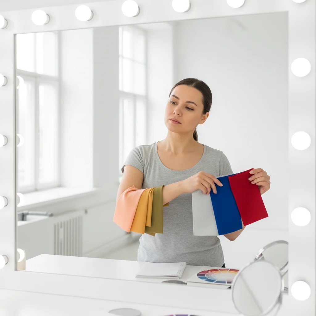
Step 3: Define Your Core and Accent Wardrobe Color Palettes
With a solid understanding of color theory and your personal color profile, it’s time to translate that knowledge into actionable wardrobe color palettes. A well-structured wardrobe typically consists of a core palette and an accent palette. This division ensures versatility and allows for creative expression without sacrificing cohesion.
Building Your Core Wardrobe Color Palette
Your core palette should consist of 3-5 neutral colors that form the foundation of your wardrobe. These are the workhorses – the colors of your staple items like trousers, skirts, blazers, coats, and foundational tops. They should be versatile, timeless, and, most importantly, flattering to your personal color season and undertone.
- Neutrals for Cool Undertones: Black, charcoal grey, navy blue, true white, cool beige, taupe.
- Neutrals for Warm Undertones: Cream, ivory, camel, olive green, warm brown, stone grey.
- Neutrals for Neutral Undertones: You have more flexibility and can often pull from both cool and warm neutral ranges.
The beauty of a strong core palette is that all these items should ideally mix and match seamlessly. This maximizes your outfit combinations and simplifies daily dressing. When selecting items for your core wardrobe color palettes, prioritize quality and classic styles that will endure beyond a single season. Think about how these colors interact with each other. A monochromatic neutral base, like varying shades of grey, can be incredibly chic and sophisticated.
Selecting Your Accent Wardrobe Color Palette
Once your core is established, you can introduce accent colors. These are the colors that bring personality, vibrancy, and a touch of trendiness to your outfits. They are typically used for tops, accessories (scarves, jewelry, handbags), and statement pieces. Your accent palette should consist of 2-4 colors that:
- Are flattering to your personal color season: Choose colors that make your eyes sparkle and your skin glow.
- Complement your core neutrals: Ensure they look good when paired with any of your core colors.
- Reflect your personal style: Do you prefer bold and bright, or soft and subtle?
- Can be mixed and matched with each other: Ideally, your accent colors should also work well together to create more dynamic looks. For example, if your core is navy and grey, you might choose emerald green and fuchsia as accents for a vibrant winter palette.
Example of Core and Accent Palettes:
- For a Cool Summer (muted, cool):
- Core: Navy, charcoal grey, cool beige, white.
- Accents: Dusty rose, periwinkle blue, sage green, lavender.
- For a Warm Autumn (deep, warm):
- Core: Olive green, rust, deep orange, mustard yellow, deep teal, terracotta.
- Accents: Rust, mustard yellow, deep teal, terracotta.
This systematic approach to building your wardrobe color palettes ensures that every new purchase is a thoughtful addition that enhances your existing collection, rather than a standalone item that clashes. It’s about creating a cohesive ecosystem of garments where everything plays well together.
Step 4: Curating and Maintaining Your 2026 Wardrobe Color Palettes
Building your ideal wardrobe color palettes is an ongoing process of curation and refinement. The fashion landscape of 2026 will undoubtedly bring new trends, but with a strong color foundation, you can adapt these trends to your personal style without completely overhauling your wardrobe. This final step focuses on practical application and long-term maintenance.
Shopping Smart with Your Palettes in Mind
Armed with your defined core and accent wardrobe color palettes, shopping becomes a much more targeted and efficient experience. Before making a purchase, ask yourself:
- Does this color flatter my personal season and undertone?
- Does it fit into my core or accent palette?
- Can I create at least three different outfits with items I already own using this new piece?
This discipline helps prevent impulse buys and ensures that new additions genuinely enhance your wardrobe’s versatility. For 2026, look for trends that align with your established palettes. If ‘digital lavender’ is trending and you’re a Cool Summer, it might be a perfect accent. If ‘spicy mustard’ is in vogue and you’re a Warm Autumn, it could be a fantastic addition. The goal is to incorporate trends thoughtfully, not blindly.
Building a Capsule Wardrobe with Your Palettes
The concept of a capsule wardrobe aligns perfectly with the principles of curated wardrobe color palettes. A capsule wardrobe is a collection of a few essential items of clothing that can be mixed and matched to create numerous outfits. By focusing on your core neutrals and a handful of complementary accents, you can create a highly functional and sustainable capsule wardrobe that reduces decision fatigue and maximizes your styling options.
Consider creating seasonal capsules based on your existing palettes. For example, your winter capsule might lean heavily on deeper versions of your core colors, while a summer capsule might feature lighter tints and brighter accents. The underlying color harmony remains consistent, ensuring everything still works together.
Flexibility and Evolution of Your Palettes
While your personal color season is constant, your personal style and preferences may evolve. Your wardrobe color palettes aren’t set in stone forever. Periodically review your wardrobe:
- Declutter: Remove items that no longer fit your palette, don’t flatter you, or simply don’t spark joy.
- Re-evaluate: Are there new colors you’re drawn to? Can they be incorporated as new accents while maintaining overall harmony?
- Experiment: Don’t be afraid to try new combinations within your established palettes. Sometimes the most unexpected pairings can yield the most stylish results.
For 2026, consider incorporating textures and prints that feature your palette colors. A striped top with colors from your accent palette, or a textured blazer in a core neutral, can add depth and interest without disrupting the color harmony. The key is to see your palette as a guiding framework, not a rigid prison.
Beyond the Basics: Advanced Tips for Your 2026 Wardrobe Color Palettes
Once you’ve mastered the foundational steps, you can delve deeper into refining your wardrobe color palettes for an even more sophisticated and personalized approach in 2026.
Understanding Value and Chroma
Beyond hue (the pure color), two other important aspects of color are value and chroma:
- Value: How light or dark a color is. Mixing different values within your palette (e.g., a dark navy with a pale blue) adds visual interest and dimension to an outfit. High contrast in value can create a dramatic look, while low contrast can be softer and more blended.
- Chroma (or Saturation): How intense or muted a color is. Some people look best in bright, clear colors (high chroma), while others are flattered by softer, more muted tones (low chroma). Your personal color season helps guide this. A Winter might thrive in high-chroma royal blue, while a Summer might prefer a low-chroma periwinkle.
Incorporating a variety of values and chromas within your selected hues can make your wardrobe color palettes much richer and more dynamic, allowing for greater versatility in styling different moods and occasions.
The Power of Metallics and Neutrals
Metallics aren’t just for jewelry; they can be powerful additions to your wardrobe color palettes. Gold, silver, bronze, and rose gold can act as sophisticated neutrals or glamorous accents. Just like with your skin undertone, certain metallics will flatter you more:
- Cool Undertones: Silver, platinum, white gold.
- Warm Undertones: Gold, bronze, copper.
- Neutral Undertones: Can often wear both successfully.
Incorporating metallic accessories or subtle metallic threads in fabrics can elevate an outfit without clashing with your primary color schemes. Similarly, expanding your understanding of neutrals beyond black and white to include shades like olive, burgundy (for some cool seasons), and deep forest green (for some warm seasons) can add depth and sophistication to your core wardrobe color palettes.
Considering Your Lifestyle and Occasions
Your wardrobe color palettes should also align with your lifestyle. If your work environment is very corporate, your core palette might lean towards classic, subdued neutrals. If you work in a creative field or have a very social lifestyle, you might incorporate more vibrant accent colors into your everyday wear.
Think about the events you regularly attend. Do you need a formal evening palette? A relaxed weekend palette? While your personal color season remains the guide, the application of those colors can be tailored to suit different aspects of your life. This ensures your wardrobe is not only beautiful but also highly functional for all your needs in 2026.
Conclusion: Your Stylish 2026 Wardrobe Awaits
Building a wardrobe based on thoughtfully constructed wardrobe color palettes is an investment in your personal style, your confidence, and the longevity of your clothing choices. By understanding the fundamentals of color theory, identifying your unique personal coloring, defining your core and accent palettes, and then curating with intention, you’re setting yourself up for sartorial success in 2026 and beyond.
No more standing in front of a full closet with nothing to wear. No more impulse buys that don’t quite fit. With these four steps, you gain the power to create a cohesive, versatile, and deeply flattering wardrobe where every piece works in harmony. Embrace the journey of discovering your perfect colors, and watch as your personal style transforms into an effortlessly chic and authentically you expression. Your stylish, sustainable, and perfectly coordinated 2026 wardrobe is now within reach!