Color Confidence: Your 2026 Guide to Choosing and Pairing Colors for Your U.S. Wardrobe
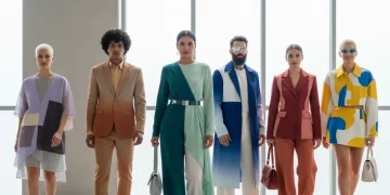
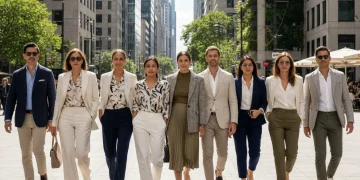
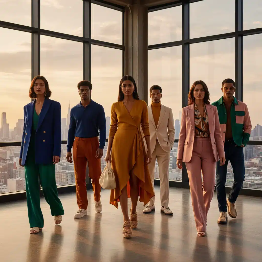
In the dynamic world of fashion, mastering the art of wardrobe color pairing is more than just a skill; it’s a superpower. As we step into 2026, the landscape of U.S. fashion continues to evolve, bringing with it exciting new palettes and timeless classics. Whether you’re aiming for a professional, casual, or statement look, understanding how to choose and combine colors can elevate your style, boost your confidence, and ensure you always make a memorable impression. This comprehensive guide will equip you with the knowledge to navigate the vibrant world of colors, helping you curate a wardrobe that truly reflects your personality and the spirit of the times.
Gone are the days of strictly adhering to rigid color rules. Today’s fashion embraces fluidity, personal expression, and strategic mixing. However, a solid foundation in color theory and an awareness of current trends remain crucial. This article delves into identifying your personal color palette, understanding the psychological impact of colors, exploring 2026 U.S. fashion color trends, and providing practical tips for impeccable wardrobe color pairing.
Understanding the Basics: Color Theory for Your Wardrobe
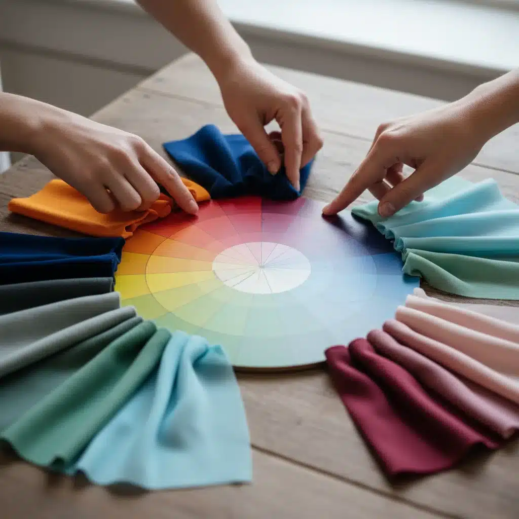
Before diving into specific trends or combinations, a quick refresher on color theory can dramatically improve your wardrobe color pairing skills. The color wheel is your best friend here, offering a visual representation of how colors relate to each other.
The Color Wheel Explained
- Primary Colors (Red, Blue, Yellow): These are the foundational colors from which all other colors are derived.
- Secondary Colors (Orange, Green, Purple): Created by mixing two primary colors.
- Tertiary Colors (e.g., Red-Orange, Blue-Green): Formed by mixing a primary and a secondary color.
Key Color Relationships for Effective Wardrobe Color Pairing
- Complementary Colors: Directly opposite each other on the color wheel (e.g., red and green, blue and orange, yellow and purple). These create high contrast and vibrant looks. When used correctly, they can make an outfit pop. For instance, a deep navy suit paired with an orange tie can be strikingly elegant.
- Analogous Colors: Three colors that are next to each other on the color wheel (e.g., blue, blue-green, green). These create harmonious, low-contrast looks that are pleasing to the eye. Think of a sophisticated outfit built around various shades of blue and green.
- Monochromatic Colors: Different shades, tints, and tones of a single color. This creates a cohesive, elegant, and often slimming effect. A head-to-toe look in varying shades of grey or beige exemplifies this.
- Triadic Colors: Three colors equally spaced on the color wheel (e.g., red, yellow, blue). These combinations are vibrant and bold, requiring careful balancing to avoid overwhelming the eye.
Understanding these relationships is the cornerstone of effective wardrobe color pairing. It allows you to move beyond guesswork and create intentional, impactful outfits.
Discovering Your Personal Color Palette
While trends come and go, certain colors will always look better on you than others. This is determined by your personal coloring – your skin tone, hair color, and eye color. Identifying your personal color palette is a game-changer for wardrobe color pairing, ensuring every outfit enhances your natural beauty.
Warm vs. Cool Undertones
The first step is to determine if you have warm or cool undertones:
- Warm Undertones: Your veins appear greenish, gold jewelry looks best on you, and you tend to tan easily. You likely suit earthy tones, warm reds, oranges, yellows, olive greens, and golden browns.
- Cool Undertones: Your veins appear bluish or purple, silver jewelry looks best, and you might burn easily in the sun. You’ll shine in jewel tones, true blues, emerald greens, purples, cool reds (like fuchsia), and stark whites.
- Neutral Undertones: You have a mix of both, or your veins are hard to distinguish. You’re lucky – you can pull off both warm and cool shades!
The Seasonal Color Analysis (Simplified for 2026)
A more detailed approach, seasonal color analysis, categorizes individuals into ‘seasons’ (Spring, Summer, Autumn, Winter) based on their overall coloring. While a professional analysis is ideal, a simplified understanding can help your wardrobe color pairing:
- Spring: Light, warm, clear. Best in bright, clear, warm colors like coral, turquoise, peach, and light greens.
- Summer: Light, cool, muted. Flourishes in soft, muted, cool colors such as dusty rose, lavender, soft blues, and grey-greens.
- Autumn: Deep, warm, muted. Looks best in rich, earthy, warm colors like olive green, rust, mustard yellow, and deep teal.
- Winter: Deep, cool, clear. Shines in bold, clear, cool colors such as royal blue, emerald green, fuchsia, black, and pure white.
Once you understand your personal palette, you can prioritize colors that naturally flatter you, making wardrobe color pairing much easier and more effective. Even if a trend color isn’t in your ideal palette, you can incorporate it through accessories or by choosing a shade that leans closer to your undertone.
2026 U.S. Fashion Color Trends: What to Expect
Staying abreast of current trends is key to a modern and stylish wardrobe. While classic colors always have a place, 2026 is poised to introduce some exciting new directions in wardrobe color pairing. Expect a blend of optimism, nature-inspired hues, and a continued emphasis on sustainable choices influencing color palettes.
Key Color Trends for 2026
- Digital Lavender: This soft, calming yet futuristic purple is set to be a dominant force. It’s versatile, working well as a primary color or an accent, and pairs beautifully with neutrals or even bolder greens.
- Earthy Terracottas & Warm Neutrals: Building on the enduring popularity of natural tones, richer terracotta, rust, and clay colors will emerge. These warm neutrals offer sophistication and pair effortlessly with creams, deep blues, and even metallics.
- Vibrant Greens (Moss & Jade): Reflecting a growing connection to nature and wellness, greens in all their glory will be prominent. From deep moss to lively jade, these shades bring freshness and vitality. They are excellent for grounding an outfit or adding a sophisticated pop.
- Optimistic Oranges & Yellows: Bright, mood-boosting oranges and sunny yellows will inject energy into wardrobes. Use them as statement pieces or strategically to brighten up more subdued outfits.
- Deep Ocean Blues: Classic navy evolves into richer, more profound ocean blues, offering a sense of calm and depth. These are perfect for professional wear or elegant evening looks and are incredibly versatile for wardrobe color pairing.
- Soft Pastels (Elevated): Beyond digital lavender, other pastels like mint green, baby blue, and pale peach will be seen, but with a more sophisticated, less saccharine feel. Think pastel power suits or elegant separates.
Incorporating these trends into your wardrobe color pairing can keep your style fresh and relevant. Remember, you don’t have to adopt every trend; choose those that resonate with your personal style and complement your existing wardrobe.
Mastering Wardrobe Color Pairing: Practical Strategies
Now that you understand color theory, your personal palette, and 2026 trends, let’s dive into practical strategies for impeccable wardrobe color pairing.
1. The 60-30-10 Rule
This interior design principle applies beautifully to fashion. It suggests that 60% of your outfit should be a dominant color, 30% a secondary color, and 10% an accent color. This creates balance and visual interest without being overwhelming.
- Example: A dominant navy dress (60%), paired with a complementary orange blazer (30%), and finished with a delicate gold necklace (10%). This is a classic example of effective wardrobe color pairing.
2. Building from Neutrals
Neutrals (black, white, grey, beige, navy, brown) are the backbone of any versatile wardrobe. They provide a calm base that allows other colors to shine. Start with a neutral foundation and then layer in colors.
- Example: A grey pant suit (neutral base) can be paired with a vibrant digital lavender blouse (trend color) and classic black heels.
3. Experimenting with Tonal Dressing
Tonal dressing, or monochromatic dressing, involves wearing different shades, tints, and tones of the same color. It’s chic, sophisticated, and makes wardrobe color pairing incredibly easy.
- Example: A light beige trench coat over a cream sweater, paired with camel trousers and nude shoes. This creates a long, lean, and elegant silhouette.
4. The Power of Complementary Accents
If you’re hesitant about bold color combinations, use complementary colors as accents. A pop of a complementary color can instantly elevate a simple outfit.
- Example: A dark green dress with a pair of ruby red earrings or a blue shirt with an orange pocket square. This strategic wardrobe color pairing adds visual flair without commitment.
5. Analogous Harmony
For a softer, more harmonious look, combine analogous colors. This creates a seamless flow and is often perceived as sophisticated and understated.
- Example: A teal skirt paired with a navy top and a lighter blue scarf. All are next to each other on the color wheel, creating a serene and stylish ensemble.
6. Don’t Forget Texture and Pattern
Texture and pattern play a vital role in wardrobe color pairing. Different textures reflect light differently, adding depth even to monochromatic outfits. Patterns introduce multiple colors, so ensure they align with your chosen palette. A patterned scarf or tie can tie together an entire look.
Psychology of Colors in U.S. Fashion
Colors do more than just look good; they evoke emotions and send messages. Understanding the psychology of colors can help you choose the right hues for different occasions, further enhancing your wardrobe color pairing strategy.
- Red: Power, passion, energy, confidence. Great for making a statement or commanding attention.
- Blue: Trust, stability, calmness, professionalism. Ideal for business meetings or situations where you want to project reliability.
- Yellow: Optimism, happiness, creativity, warmth. Excellent for casual settings or to uplift spirits.
- Green: Nature, growth, harmony, freshness. Perfect for outdoor events or to convey a sense of balance.
- Purple: Luxury, royalty, creativity, wisdom. Use for sophisticated events or when you want to appear unique.
- Orange: Enthusiasm, warmth, excitement, friendliness. A great choice for social gatherings.
- Black: Sophistication, elegance, authority. A timeless choice for formal wear, but can also convey seriousness.
- White: Purity, simplicity, cleanliness. Often used for a fresh, crisp look or in summer.
- Grey: Balance, neutrality, sophistication. A versatile base color that pairs well with almost anything.
By consciously selecting colors based on their psychological impact, you can add another layer of intention to your wardrobe color pairing, ensuring your outfit communicates exactly what you want it to.
Wardrobe Color Pairing for Different Occasions in 2026 U.S.
The context of your outfit dictates your color choices. Here’s how to adapt your wardrobe color pairing for various scenarios in the U.S. in 2026:
Professional Settings
For the office or formal business events, classic and muted tones often reign supreme, but 2026 allows for subtle pops of color.
- Go-to: Navy, charcoal grey, black, white, cream.
- 2026 Update: Pair a deep ocean blue suit with a digital lavender blouse for a modern, approachable professional look. Or, a classic grey dress with moss green accessories for a touch of contemporary elegance.
- Avoid: Overly bright or clashing combinations that might distract.
Casual & Everyday Wear
This is where you can truly experiment and express your personal style with wardrobe color pairing.
- Go-to: Jeans, t-shirts, comfortable knits in any color.
- 2026 Update: Combine earthy terracotta trousers with a cream knit and a vibrant yellow scarf for a cheerful yet grounded look. Or, a relaxed outfit in analogous greens for a nature-inspired aesthetic.
- Experiment: Mix patterns with solid colors, or try bold complementary accents.
Evening & Formal Events
Elegance and impact are key here. Deeper, richer colors or sophisticated monochromatic looks work best.
- Go-to: Black, navy, deep jewel tones (emerald, ruby, sapphire).
- 2026 Update: A gown in deep ocean blue or jade green will be stunning. Consider a monochromatic look in a luxurious fabric like satin or velvet for an opulent feel. Digital lavender can also be elevated for evening wear in a sophisticated silhouette.
- Focus: Quality fabrics and thoughtful accessorizing to enhance the chosen colors.
Seasonal Considerations
While U.S. fashion is increasingly globalized, seasons still influence color choices:
- Spring: Lighter, brighter pastels and fresh greens.
- Summer: Vibrant, saturated colors and crisp whites.
- Fall: Rich, warm, earthy tones like rust, mustard, and deep reds.
- Winter: Deep jewel tones, classic neutrals, and bold metallics.
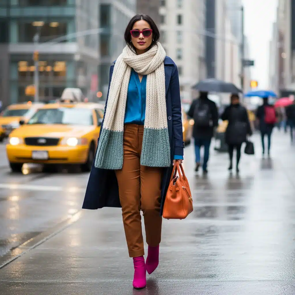
Common Wardrobe Color Pairing Mistakes to Avoid
Even with a good understanding of color, it’s easy to fall into common traps. Being aware of these can save you from fashion faux pas and ensure your wardrobe color pairing is always on point.
- Overdoing It: Too many bright, clashing colors can make an outfit look chaotic. Stick to the 60-30-10 rule or focus on one or two dominant colors.
- Ignoring Undertones: Wearing colors that clash with your skin’s undertones can make you look sallow or washed out. Always prioritize colors that flatter your complexion.
- Forgetting About Contrast: An outfit entirely in similar mid-tones can appear flat. Introduce some contrast through lighter or darker shades, or a pop of a complementary color.
- Not Considering the Occasion: While bold colors are great for parties, they might not be appropriate for a conservative business meeting. Match your wardrobe color pairing to the event’s formality.
- Neglecting Accessories: Accessories are powerful tools for introducing color or tying an outfit together. Don’t underestimate the impact of a colored scarf, bag, or shoes.
- Sticking to Only Neutrals: While neutrals are essential, relying solely on them can make your wardrobe feel uninspired. Don’t be afraid to gradually introduce color!
Building a Smart 2026 U.S. Wardrobe for Color Confidence
Creating a wardrobe that facilitates confident wardrobe color pairing is an ongoing process. It involves thoughtful curation and strategic purchases.
Invest in Versatile Basics
Start with high-quality neutral pieces (trousers, skirts, blazers, foundational tops) in colors like black, navy, grey, white, and beige. These form the canvas for your colorful expressions.
Gradually Introduce Trend Colors
You don’t need to overhaul your entire wardrobe each season. Introduce 2026 trend colors through key pieces like a new top, a statement jacket, or accessories (scarves, handbags, shoes). This allows you to experiment with wardrobe color pairing without a huge investment.
Focus on Your Best Colors
Once you’ve identified your personal color palette, prioritize buying main wardrobe items in those flattering shades. This ensures that even when you’re simply grabbing an outfit, you’ll look your best.
Mix High and Low
Combine classic, investment pieces with more trend-driven, affordable items. This allows for flexibility and keeps your style current without breaking the bank.
Organize Your Closet by Color
A color-organized closet can dramatically simplify your morning routine and inspire new wardrobe color pairing ideas. You’ll easily see what you have and how different items can work together.
Conclusion: Embrace Your Color Journey in 2026
The journey to mastering wardrobe color pairing is a personal and exciting one. As we navigate 2026, remember that fashion is about expression, confidence, and feeling good in your own skin. By understanding the fundamentals of color theory, identifying your personal palette, staying aware of U.S. fashion trends, and employing smart pairing strategies, you can transform your wardrobe into a powerful tool for self-expression.
Don’t be afraid to experiment. Start small, perhaps by introducing a new accent color, and gradually build your confidence. The goal isn’t to follow rules blindly, but to understand them so you can break them intentionally and stylishly. Your wardrobe is an extension of you – make it as vibrant, sophisticated, and unique as you are. Embrace the colors of 2026 and step out with unwavering color confidence!